Oral History: The O Turns 20
08/15/19 | General, @GoDucksMoseley
This season marks 20 years since UO Athletics and Nike unveiled the now iconic logo. Read about the genesis of the logo's design, from Mike Bellotti, Tinker Hatfield, Todd Van Horne and Joey Harrington.
This September, Oregon athletics will mark 20 years since the debut of the now-iconic "O" logo that has made the University of Oregon an international brand. The logo was unveiled on Dec. 23, 1998, when the Ducks in coordination with Nike introduced new uniforms, school colors and the logo during the week leading up to the football team's Aloha Bowl appearance. But its genesis was more than two years earlier, in the wake of the 1995 UO football team's Cotton Bowl appearance. For UO alum and Nike CEO Phil Knight, it was the first game in which his alma mater was outfitted in uniforms supplied by the company he co-founded – but also it was the Ducks' second straight loss in a New Year's Day bowl game.
TODD VAN HORNE, Nike's creative director for apparel: I think Knight had a blast there. He thought that was so much fun. His idea was, how can we get some of the great thinkers around Nike, and among Oregon's alumni, and do this more often?
MIKE BELLOTTI, former UO head coach: We felt like the momentum of the program was good, but it needed more. And Phil asked me after the Cotton Bowl what we needed to take the next step. I said, an indoor practice facility. That's something (Bellotti's predecessor) Rich Brooks and I had talked about; he was really adamant that was what we needed here, to be able to practice year-round and get the skill athletes and that type of thing. So Phil said, how soon can we get that done? And I said, well, we've got to raise funds, and …
And he says, no, no, no. How soon can we get that done? I said, oh, well, you know, we could put a plan together. It ended up taking about a year and a half. But that was the impetus, I think, for us to consider how we can change the image of Oregon football. Phil was all-in. And that certainly helped.
TINKER HATFIELD, Nike vice president for design and special projects: A little bit after that bowl game, Knight called a meeting. He just invited me into his office along with a couple of others, including Michael Doherty (Nike's creative director for global brand presentation). And he simply posed a question to the group of us. 'All right, guys. I think the University of Oregon might have a chance to enter onto the national stage in sports and academics. But we're going to have to help them. How can we do that?'
He was encouraged by how the football program was rising up, and impressed by what Coach Brooks and Coach Bellotti had done. And he wanted to use it as a springboard to help them get further. What that meant was, how do we attract even better student-athletes, so that the coaching staff – which was proving to be pretty, pretty good – would have more to work with?
VAN HORNE: It was an interesting time at Nike because we had just started getting into the team sports business. We'd just started a division called Organized Team Sports, a way for the apparel division to really put an authentic footprint on uniforms, across the nation.
One of our first projects with the NFL was the Denver Broncos. When we launched that (in 1997) and they go and have a Super Bowl season, it was like all the planets aligned. Tinker Hatfield said, hey, if you can do this with the Denver Broncos, we've got some excitement around the University of Oregon. We just signed that contract – let's do something similar with Oregon now.
BELLOTTI: I believed that we had to reach out across the nation to be able to get to more recruits. And a visual thing that caught their attention was certainly going to help. Now, winning had to happen; you can't put a new uniform out there and then flop on the field – it wasn't going to work.
HATFIELD: My recollection is that (Knight) gave us a week to come back with some ideas. I wrote down a whole list of things, and it was pretty long and involved, because I put a lot of thought into it. And the first thing I told them was, you've got an image problem. You've got a branding problem.
VAN HORNE: Tinker, obviously he's a very brand-conscious, youth-oriented product thinker. He thought we should rebrand the University of Oregon and differentiate it from other Oregon schools, and even other schools across the nation. The old interlocking UO and Oklahoma's OU looked very similar; people didn't know the difference between Oregon and Oregon State. So Tinker said, let's rebrand Oregon and make them young and cool and different.
HATFIELD: I said, we need to eliminate the U. We had done some research, and there was no university that was represented by a single O. So I said, why don't we own the O?
BELLOTTI: I thought it fit perfectly, because there was always a lot of confusion about the UO and OU, and who were we and who was everybody else? So we wanted something that stood out.
HATFIELD: As we start to design the logo, we know we're not going to make it like, old school college. It's going to support the idea that the University of Oregon is this open-minded, forward-thinking, futuristic place. And Phil's like, that all sounds pretty good. To his credit, he could have said, well that's stupid. And give Bellotti a ton of credit for being open-minded in looking for ways to compete at a higher level.
One of the first people I called was Todd Van Horne. Because I knew we were going to need somebody with more apparel chops and graphic design chops. And then we just started designing, and writing, and started to build a narrative. When I design a product, there's always a story behind it. You have to justify why someone should spend money on it. So I was used to telling stories.
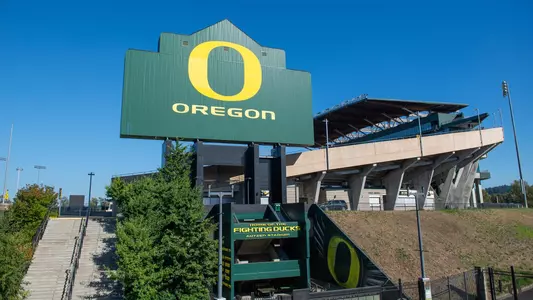
Hatfield and the design team conceived of various different versions of a new logo incorporating a single 'O'. The team had a Eureka moment when a former Nike employee working under Van Horne, Rick Bakas, brought to the discussion a design that featured outlines of two iconic UO athletics facilities.
HATFIELD: We were sitting around and he says, does that sketch look like the perimeter of Autzen Stadium? And the inside, is that like the oval of a track? And I'm like, we're onto something. This can be part of the story.
VAN HORNE: We had seen a lot of different versions, and we were discussing, what do we want to represent? One of the conversations was that it needed to reflect values, not just be stylistic. The football team started at Hayward Field; now they play at Autzen. Huh. Look at that.
JOEY HARRINGTON, UO quarterback, 1998-2001: The players loved it. I cannot think of a guy that didn't like the new changes. In the discussion of what the inspiration was, we were told that the inside of the O was Hayward, and the outside was the stadium seats at Autzen. It was like, that's a great way to incorporate all the things that are iconic, things that are traditional, and turn them into something new and fresh.
VAN HORNE: It does exactly what we wanted to do. It told a story, without being complicated. It looked modern compared to the other O's out there, the collegiate styles that were more blocky. It had something we wanted to represent, as far as the future. As soon as we found that, all the other O's on the page didn't mean anything. This one means something. It had a built-in story. It was authentic.
Part II: A look at the how the new logo was received, and how it came to be one of the most identifiable logos in college athletics over the last 20 years.
To honor the 20th Anniversary of the O, click here: Goducks.com/20thAnniversary